Falmec
Awarded
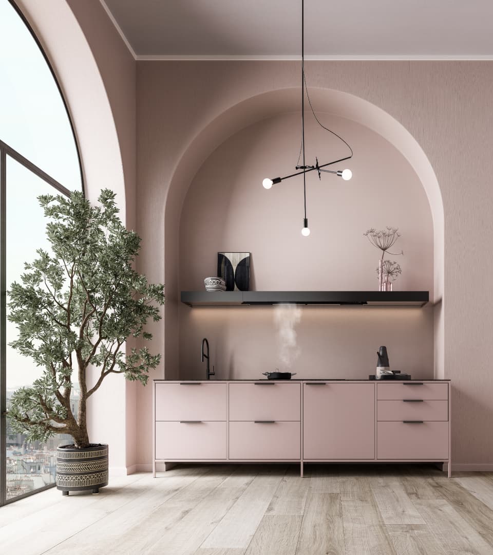
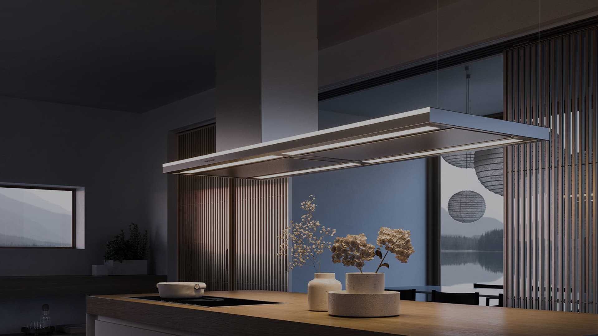
Falmec embodies the meaning of its products, designed to improve the quality of time spent at home. A leading company in the world of kitchen extraction, Falmec best represents the top of Italian design and technology applied to the home and aimed at improving convenience and comfort in everyday life.



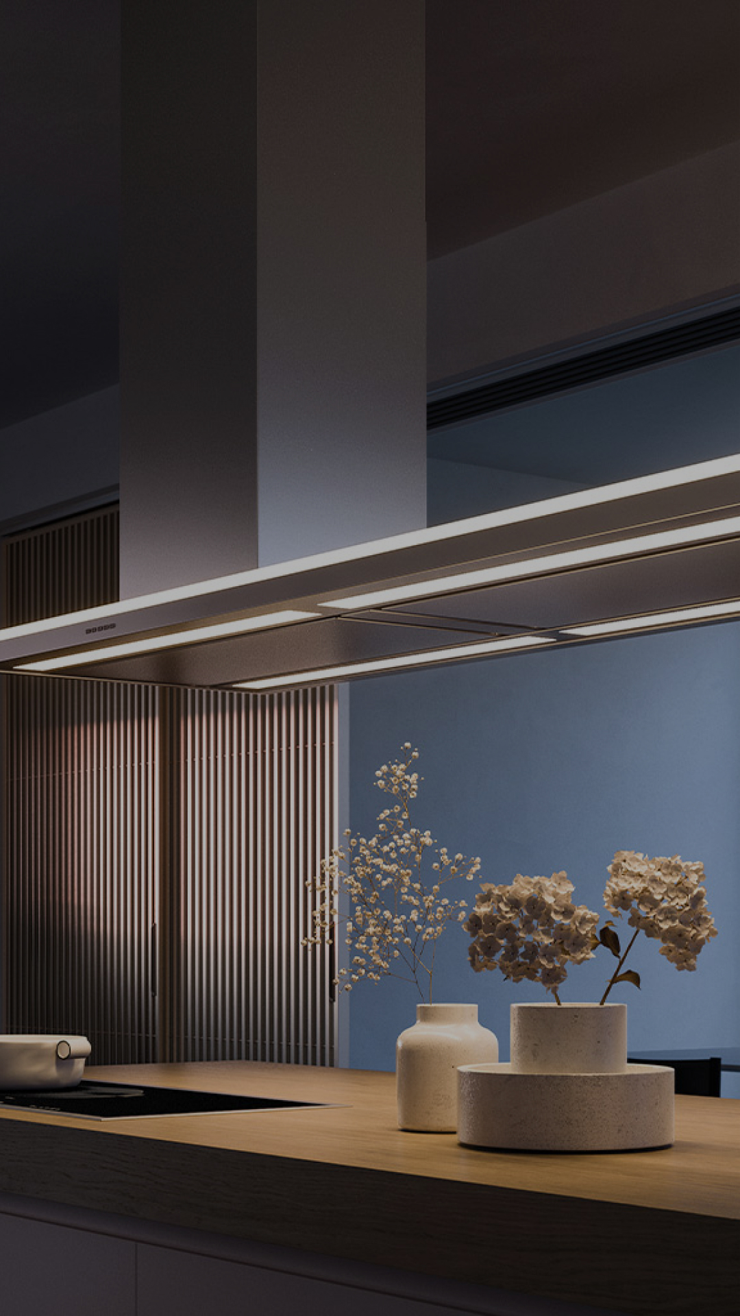
"Life inspired"
GOAL
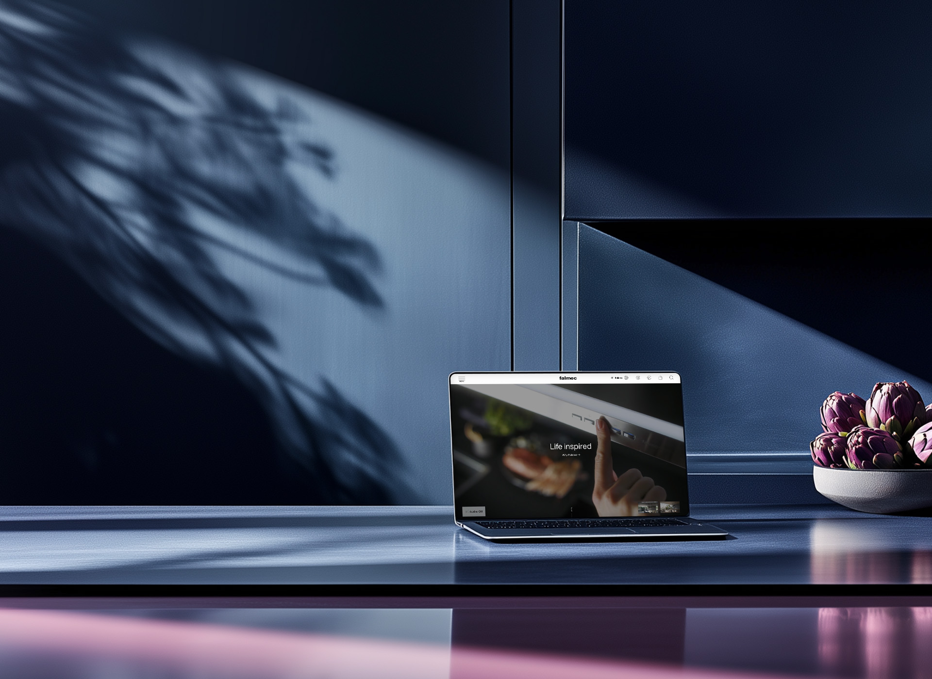
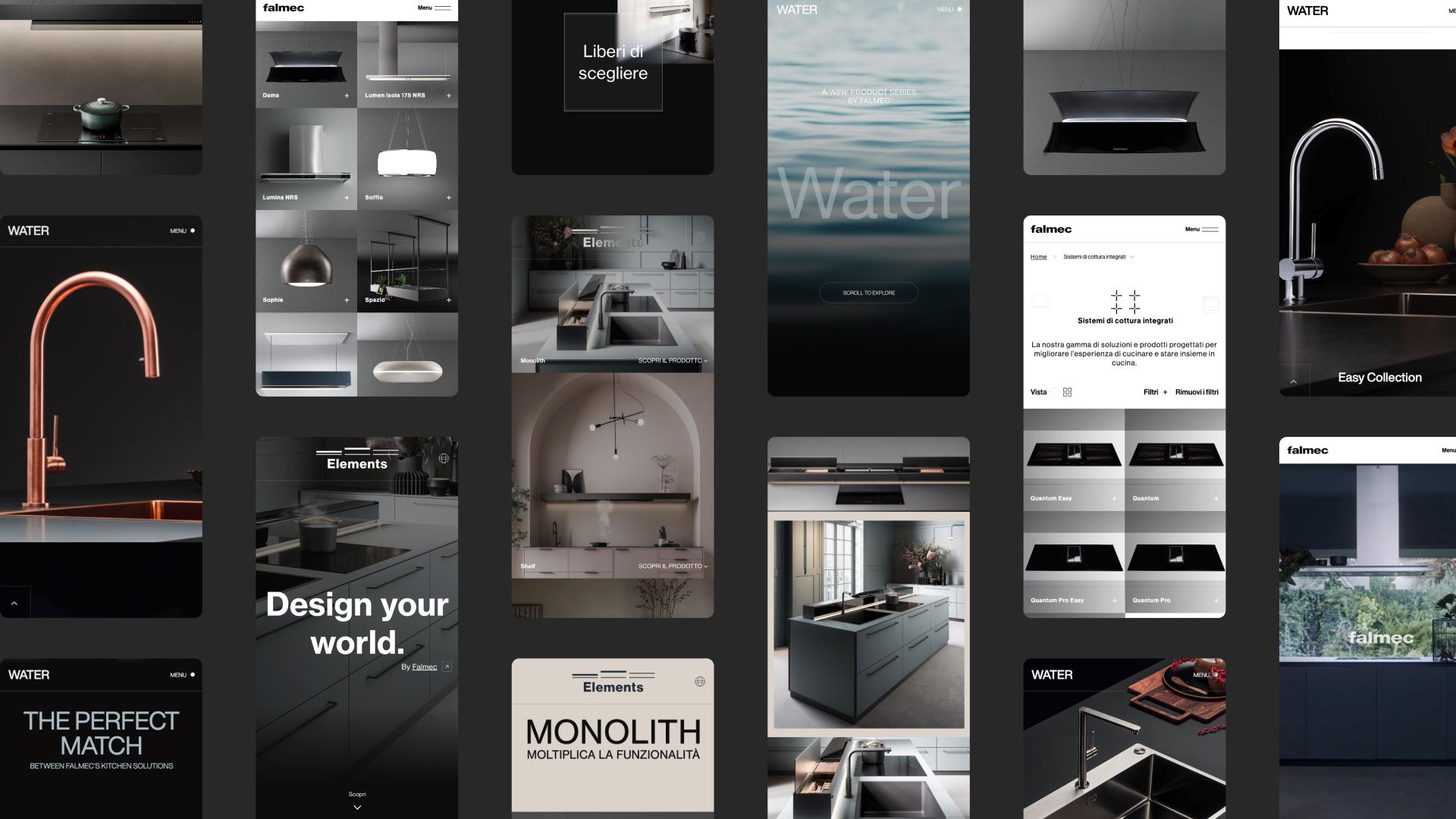
The digital experience team has successfully created a web infrastructure and a graphical interface capable of allowing the user to experience the real Falmec experience, made up of innovation, design and technology. The clean and fluid environment of the website is representative of Falmec products, created to ensure a pure environment and encourage intensive use of the busiest room in a home, the kitchen.
DIGITAL EXPERIENCE
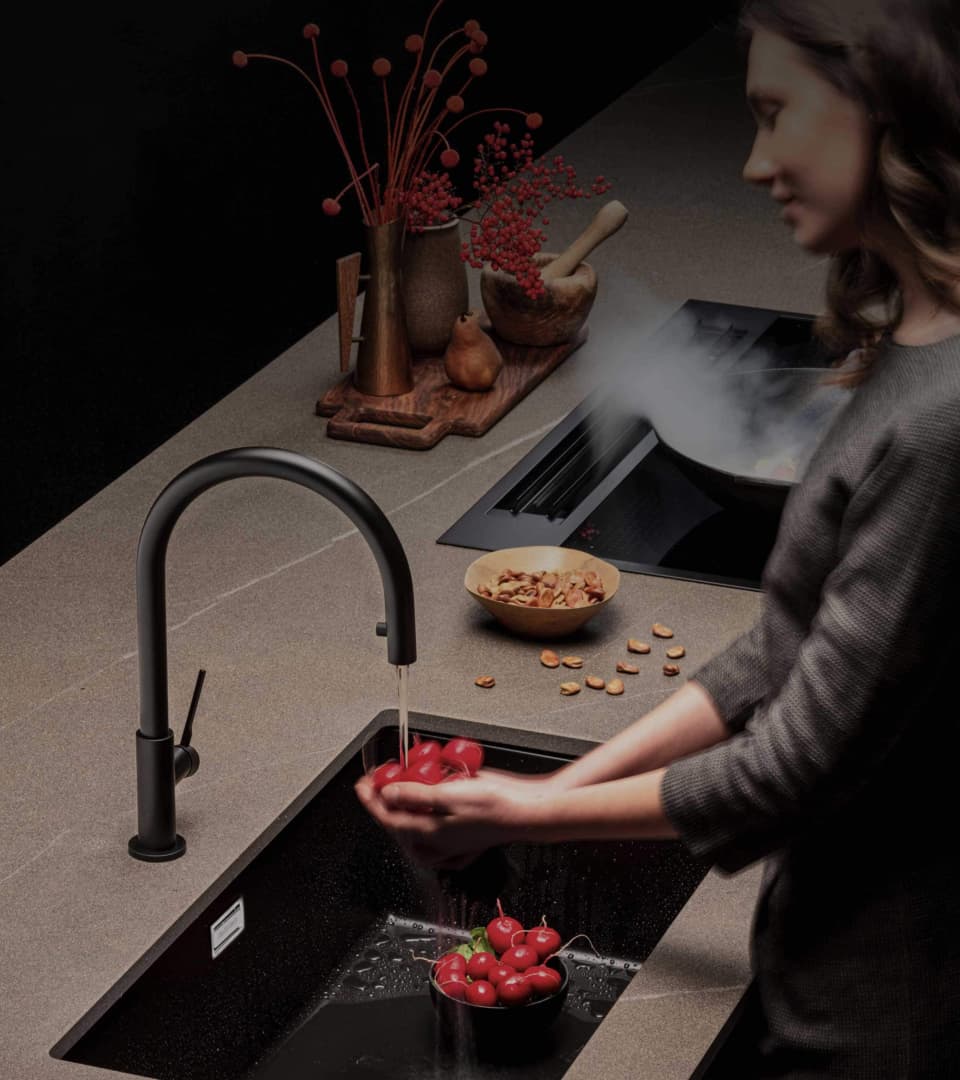
The multilingual and multi-country project effectively uses CMS and PIM to minimize the complexity of product attributes, ensuring order and functionality within a human-oriented platform. The brand is told through an Art Direction that creates a soft and relaxed rhythm, evoking domestic atmospheres through impacting images and words.
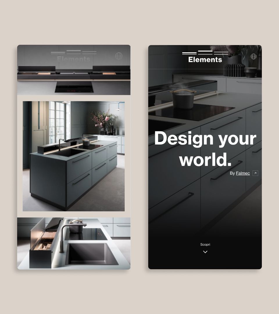
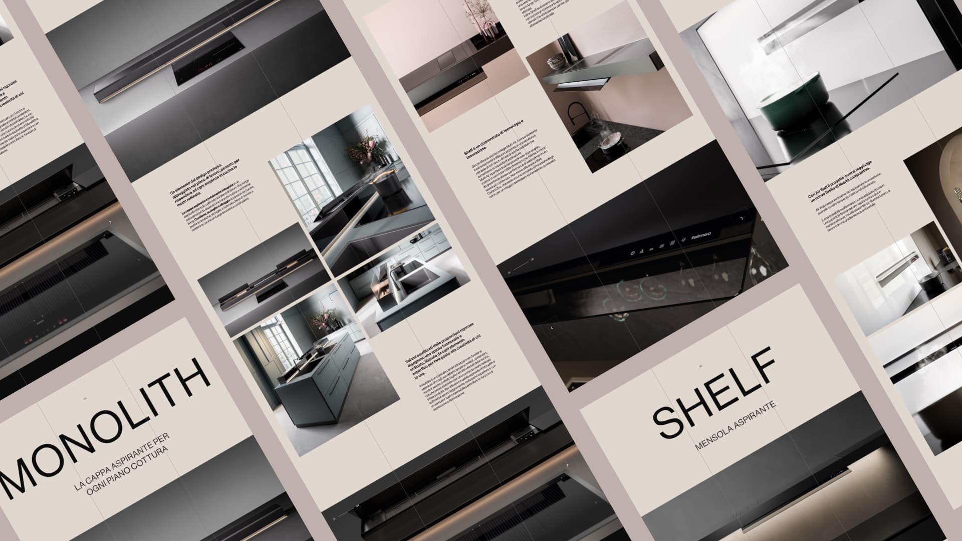
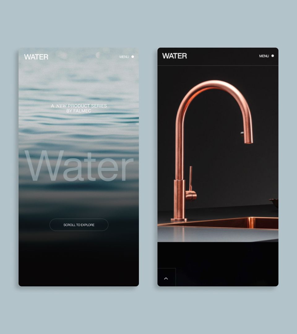
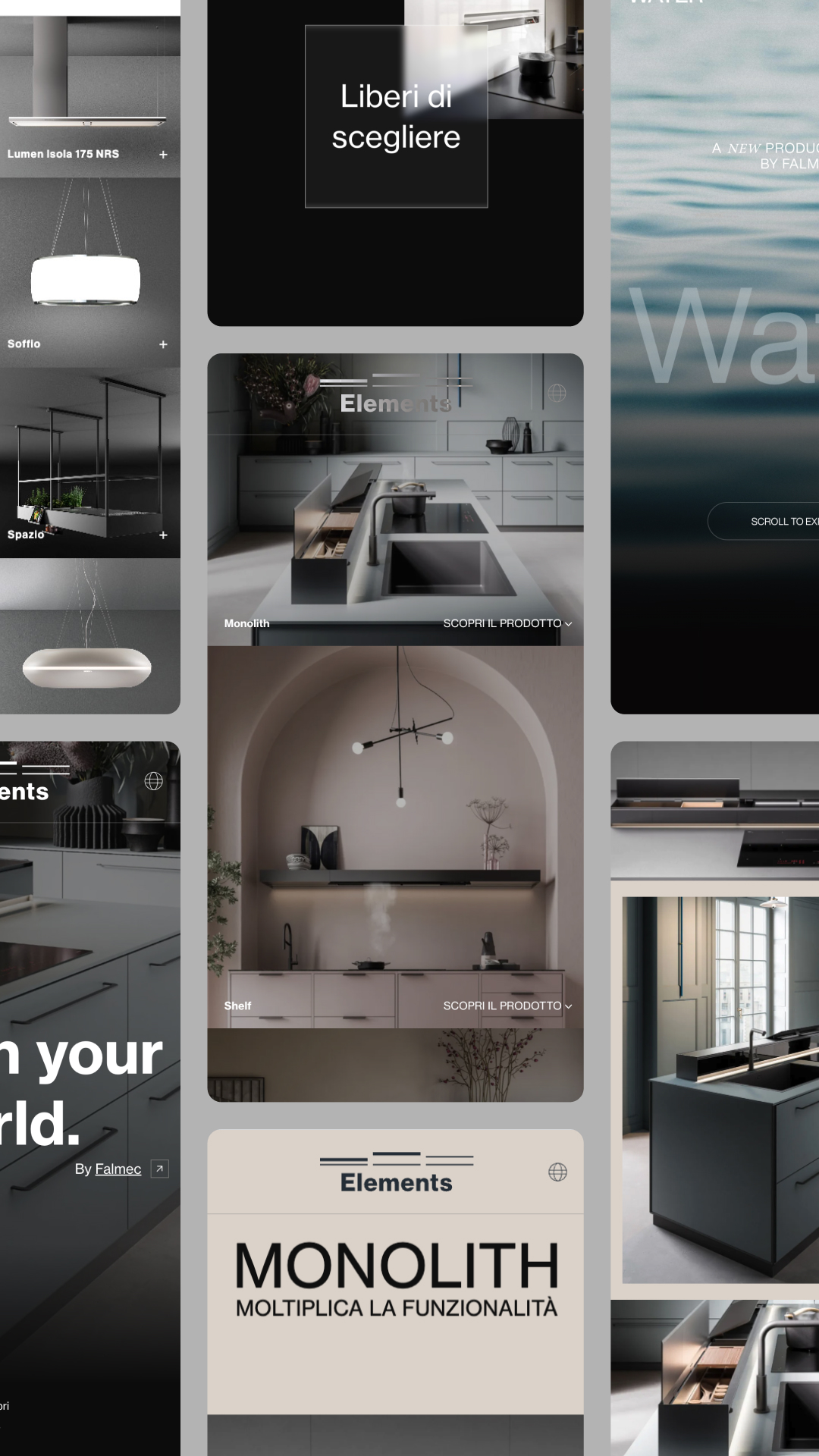
To complete the website, specific landing pages were created for Elements and Water, two product lines that stand out for their concept and design.
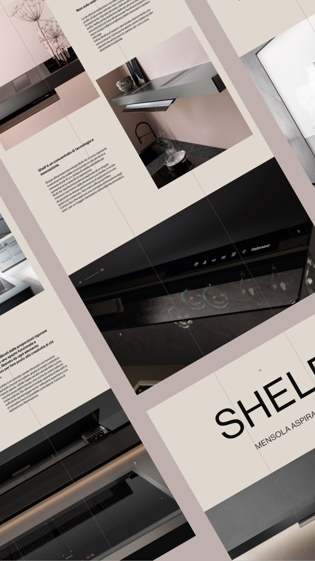
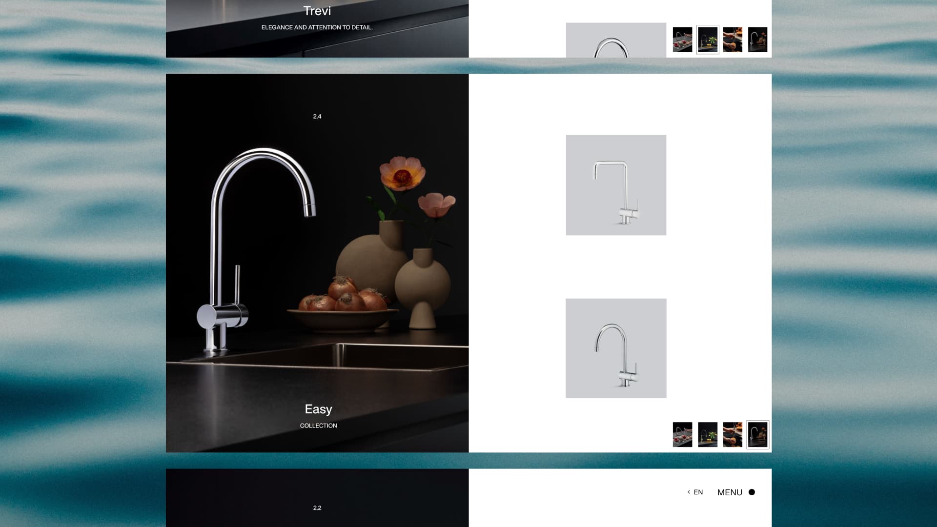
The WebGL distortion effects accompany the user in discovering the product range, while an immersive navigation provides dynamism with images and vertical and horizontal smooth scrolls. The layouts were designed on a modular grid, in which typography, images and carousels fit together with elegance and linearity, creating two consistent one-page sites.
