“What do you do for a living?” The easiest question in the world to some, a terrible nightmare to me.

Once I get asked, I try to formulate the best answer to show off my skills.
Something along the lines of:
"I design digital experiences", "I work in information architecture", "I create human-centered designs building from loads of analysis, testing and prototyping, many wireframes and some graphical interfaces"I don’t go on with these answers. I well know they would only get me many puzzled faces so I usually play it safe and just say: "I create websites"

And that is why we are here now. To finally let me delve a little deeper into the subject of UX and talk about how, in we-go, we put users at the centre of the design process.
We should start with a quote from D. Norman: “When you have trouble with things – whether it’s figuring out whether to push or pull a door or the arbitrary vagaries of the modern computer and electronics industries - it’s not your fault. Don’t blame yourself: blame the designer.” It is Donald Norman that during the 1990s popularized the expression “User Experience” and the acronym “UX”.
But what are we talking about? And what is UX? In a few words, it is a series of emotional, psychological and physical aspects taking place before, during and after the interaction between a person and a product, a service or a system.
It is a concept that takes into account subjective aspects, such as emotions, experiences and personal perceptions. Before UX, the emphasis was on the interaction between a given product and its users. Now though, the focus has shifted to experience: (User) Experience Design.
A website’s user experience tests the effective usability of a given website. It entails, for example, aspects such as the site architecture, its navigation paths, and its optimal layout development.
A digital experience’s effectiveness can be quantified by measuring how easy or difficult it is to navigate its user interface. Also, by rating the users’ perceptions of it. UI (user interface) therefore carries a crucial weight: sure enough, a user-friendly site will provide a satisfying experience.
UX and UI: are they the same thing?
Now that we know what UX is, let’s get to UI: the digital tool’s actual graphic interface the user interacts with. It includes various elements such as fonts and styles, text input fields, transitions, images and animations. In short, it is what you see. One thing to keep in mind about UI is that it is just one of many aspects to think about when designing the User Experience from an all-round quality perspective.

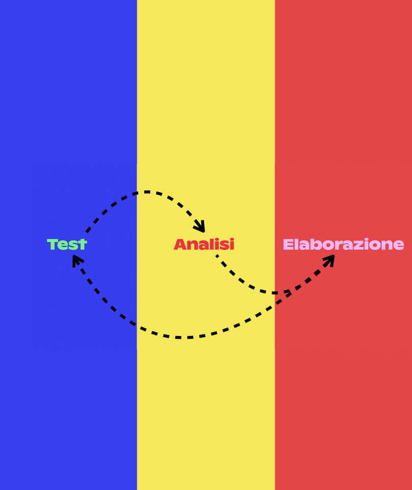
UX, we-go style: a continuous loop of testing, data analysis and processing
At we-go we strive for top-notch quality in every project. No matter how big or small the task is, we get to results through a tangible and shared workflow, one that is also destined to constantly improve.
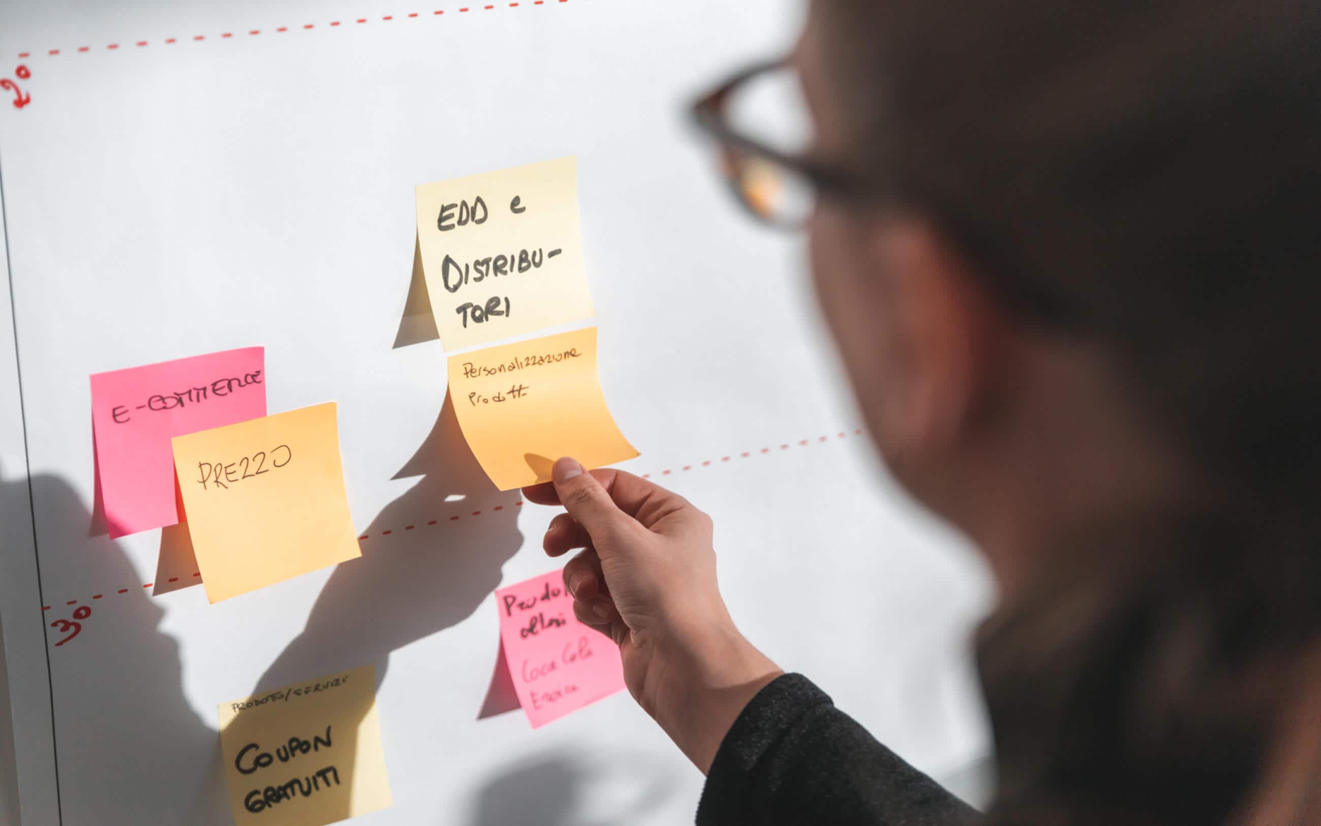
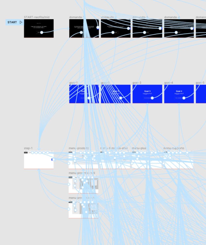
No one knows the needs and peculiarities of a business better than the people working for it. That is why we-go’s workflow is based on constant collaboration and confrontation. It starts with an exploratory phase with the client’s employees: a series of workshops including qualitative and quantitative activities such as card sorting, treetesting, ab testing, prototyping, 5-second tests…These tests help us investigate, define and understand key points and later suggest the most correct and innovative solution.
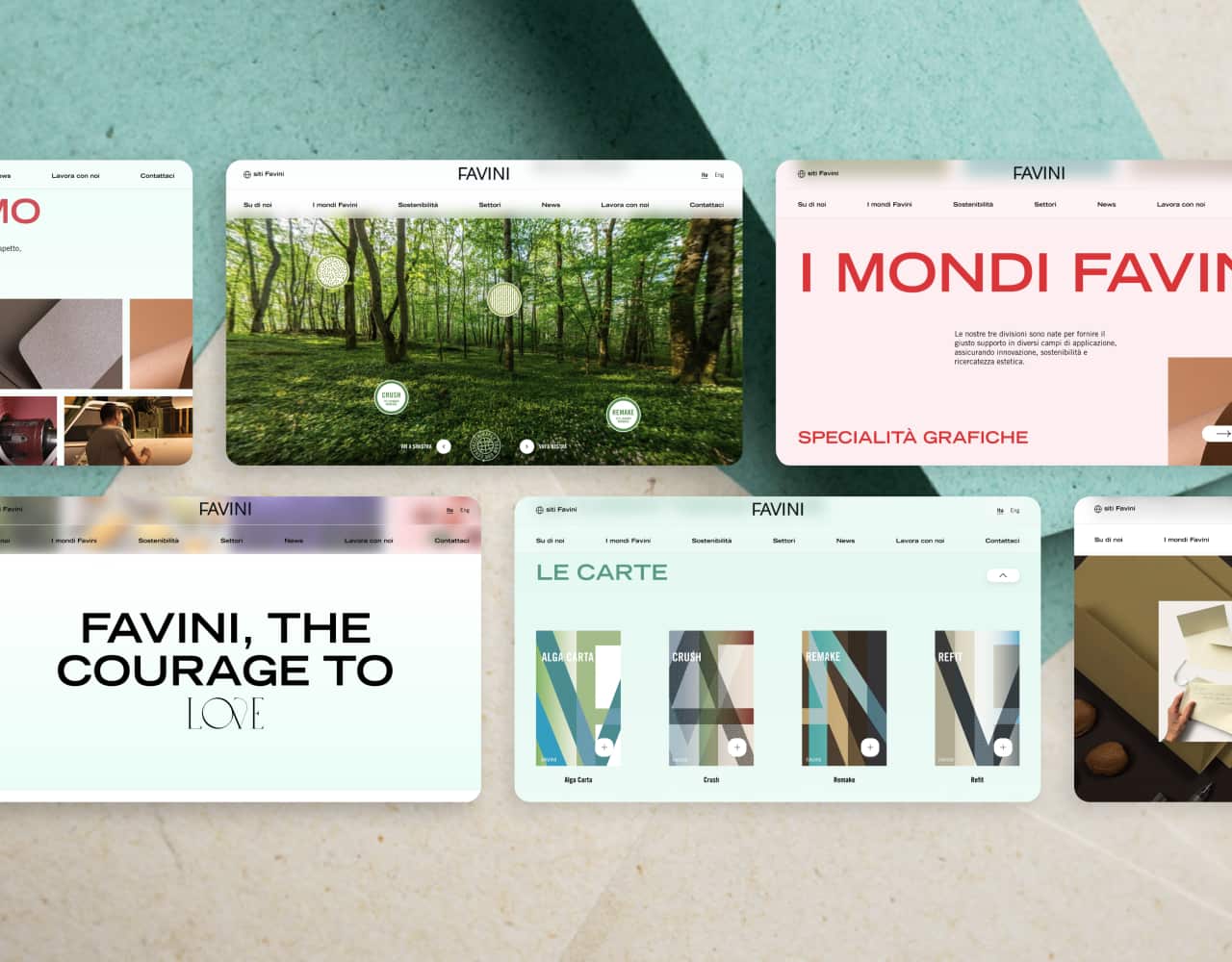
Once the information architecture has been defined and the project experience has been tested, here comes the executive phase. At this stage, the UI and Development department start working together to build a structured identity.
This phase does not closes the process, rather, it represents the beginning of a new stage aimed at collecting data and testing performances.

Before I get to the end, let’s have a look at some of the key points one needs to consider when designing effective graphical user interfaces, by citing one of the most relevant works on UX, 'Designing the User Interface: Strategies for Effective Human-Computer Interaction’:
1. Ensure coherence and consistency
The way information is conveyed needs to be standardized. That will allow users to quickly become familiar with the digital environment. The use of colours, layouts, lettering of CTAs and texts must be consistent throughout the system.
2. Offer universal usability
The needs of different types of users must be taken into account. A responsive site is the bare minimum: for a website to be universally disposable one needs to bear in mind the audience’s age, cultural or sociological background, geographical origin, level of technological expertise, and language.
3. Provide informative feedback
Each and every one of the users’ actions must be met by a response from the interface. The user needs to be aware of what is happening in a clear and readable manner.
4. Dialogue with users
Any sequence of actions must have a closure and a final step. Users must be aware they reached the end of a sequence of actions, e.g. by bumping into a paging or scroll indicator.
5. Prevent errors
Errors need to be handled by helping the user with easy-to-understand instructions. When an error arises, the user must be guided to the solution step by step.
6. Warrant reversibility
As far as possible, actions should be reversible. Make sure to offer users the chance to easily correct mistakes, e.g. with an undoing button, or a link back to the previous page.
7. Give users control
Experienced users want to be in control of the interface, meaning they would want it to respond immediately to any input.
8. Reduce short-term memory load
Avoid interfaces requiring users to memorize information. Do not let a page end without links or without giving the user the opportunity to explore further.
UX: a win-win formula!
By looking after UX, one analyses the several faces of a complex prism and contributes to the improvement and refinement of many design methodologies.
In general, it means:
- Accomplish a more productive team by streamlining processes and carrying out ideas
- Making a client satisfied with the evolution of a decision-making process
- Receiving higher quality conclusions
- Reducing costs and processing times
Practically speaking, it is a win-win formula!
Even if, when asked what I do for a living, I will still answer "I create websites", believe me, investing in UX is no longer a gamble, it's a requirement!


